Oswaldo Costa
Oswaldo Costa
A couple of amateurish shots and photomontages from the exhibition I opened yesterday, called Geometries (most original, I know).
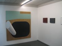
The first wall shows five works, all from the 1980s, going from less to more rigid, and ending, perhaps unexpectedly, with a figurative work, not so common in geometric art. The first (Carlos Vergara) is acrylic on canvas, the second (Dudi Maia Rosa) a slab of fiberglass pigmented from behind, the third (Geraldo de Barros) a formica collage, and the last two, contrasting two aspects of the same artist (Dionisio del Santo), are oil on canvas.
 The second wall shows a twenty year span of work by Cassio Michalany, using automotive paints on canvas. Not so easy to see in this dark photo, but the smaller work on the right, from 1987, is a tryptich, whereas the other two, from 1996 and 2007, are tetraptyches (lovely word). When I see them in museums, polyptiches often seem like affectations to me, so one thing I find interesting here is that, while the one in the middle could have been a single canvas with four bands of different colors, the one on the left, being composed of four bands of the same tone of green, can only exist as a tetraptych, so (in that sense) cannot be an affectation.
 The third wall, in contrast, shows only a two year span (1986-8) of oil on canvas paintings by Eduardo Sued, because his best work, for me, was made during this relatively short span.
 The fourth was shows two works by Renata Tassinari, from 1995 and 2003, contrasting the scales. Acrylics.
 A view of the third wall showing the mezzanine.
 Mezzanine far left showing works by Fabio Miguez, Mira Schendel and Carlos Zilio, all of which feature a single line.

 Next come works featuring several lines, drawings by Cassio Michalany and Iran do Espirito Santo, and a photograph by Christina Meirelles.
 Then another photo showing what could be called an example of local vernacular architecture next to a canvas that is the same size as the edification.
 Finally, the "wood section," featuring three works on wood, by Cassio Michalany, Sergio Camargo and Sergio Sister, ending with a Donald Judd woodcut that, with great but perhaps unintentional wit, simply printed the entire block, unmodified.
 The background music for the opening was 100% Béla Fleck & the Flecktones.
The first wall shows five works, all from the 1980s, going from less to more rigid, and ending, perhaps unexpectedly, with a figurative work, not so common in geometric art. The first (Carlos Vergara) is acrylic on canvas, the second (Dudi Maia Rosa) a slab of fiberglass pigmented from behind, the third (Geraldo de Barros) a formica collage, and the last two, contrasting two aspects of the same artist (Dionisio del Santo), are oil on canvas.